MY PERSONAL FRAMER
  • Home
    • My Personal Framer >
      • My History in Framing
      • Testimonials
    • History-Gallery & Picture Framing >
      • The Room, views from the past
      • Pictorial History of 115 N College St
  • Custom Framing
    • Why Custom Framing?
    • Elements-Design >
      • Elements-Beyond Basics
      • Elements-Neutral Framing?
      • Elements-Mats
      • Elements -Protection
      • Elements-Canvas and Needlework
      • Elements-Memorabilia and Memory Box Framing
    • Featured Frame & Other Designs >
      • Past Featured Frame
      • Gallery Framing Review
      • More Ideas
      • Client Frame Designs
      • Before & After or What a difference Design makes
  • Framed Art for Sale
  • Art
    • Whati is a print and more
    • Featured Artist
    • Featured Artists-Past >
      • Jim Christensen
      • Jim Nilsen
      • Joanne Kollman >
        • Joanne Kollman Bio
      • Terry McIllrath
      • The Raven Folio
      • Annora Spence
    • sldallas photography
    • Artist Biographies
  • Contact Me
  • Favorites
    • Art Festivals - Local & Regional
    • Framing Corner Blog

What is "Neutral Framing"

4/29/2015

0 Comments

 
Neutral framing (to me) is when the frame, mat and art are in such harmony that no one element stands out from the rest.  When you look at the art and just go aaaahh!   "Neutral need not be boring!"

When looking at art ask yourself these questions:
  • What is the color I see the most of?
  • What element of the art do you want to emphasize?
  • What do you want to minimize?
  • Does the style of art fit where I want to hang it?  Do the colors work in the room, with my furniture, with how I want the room to feel?
  • Is this a trend piece or is it a piece to last many years?
  • Do I like looking at it and will I like it for a long time?
  • Did the art cost a lot of money or just a bit?

All of these questions factor into creating your custom framed art.  It helps guide how we design it, how much you spend and where it will hang in your home.

More on Neutral Framing
0 Comments

Black is not a Frame

4/22/2015

2 Comments

 
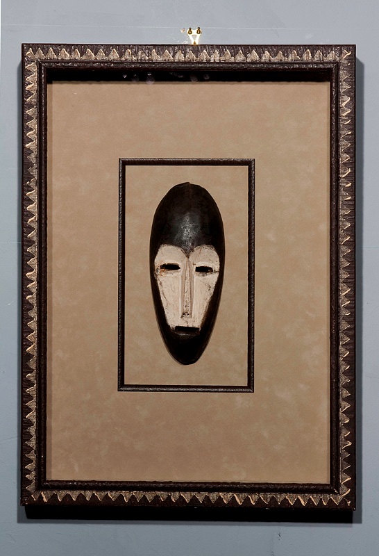
Black is not a Frame: It's a Line - Northern Michigan's Premier Picture Framer and Display Specialist
Copyright© Northern Michigan's Premier Picture Framer and Display Specialist 2014
Black and White, or any High Contrast Art


High contrast art is sometimes the hardest to design. 
The question is, "What combination brings out the most details of the art and helps me to see the art first".
  • The most logical 'maybe' is to use white or black mats and frames.  But, ask yourself this.  How much of the Black & White  photographic/etching/monopriny....  image has areas of pure white or pure black?  Often it is a variation of grays. So frame it in the gray that most makes the artwork come forward (neutral to the art).
  • A light mat on a very dark photo or picture will make the picture appear darker and decrease the visible detail by having too much intensity for the subtleties of the photograph or artwork. Vis-à-vis the dark mat on a light artwork. If the photo or artwork has large areas of darks or lights use a mat that blends with the largest amount of color (black, white, or gray).
  • Several shades of white, grays or blacks can be tried until the balance is correct and the eye travels first to the photo.

This also applies to any art form that is extremely dark or light
2 Comments

Elements of Design

4/15/2015

2 Comments

 
What do you want your framed piece to look and feel like when you get it home? 
  • Design comes down to a gut feeling, you can hear it in a person’s words “This feels right”, or “That feels wrong”.  I tell my customers that “your instincts are right 90% of the time — so trust them”.  It often when the brain and logic get involved that design mistakes happen.
  • When the art and frame design are balanced and well thought out – the viewer  will first see the whole presentation as one piece, second the art and third the framing. It is custom and each frame package is designed and hand-crafted for a specific person — there is no mass production here.
  • For instance:   the client wants to fit the art into a room where there are no colors in common with the desired artwork and wants to frame the art to match the room.  This person may get a few compliments on their art – they might hear ‘what a nice frame’, 'nice picture' or nothing at all.  No raves here!  So where is there somewhere else this artwork would show better?
  • Another example:  the artwork and framing style are out of sync with the rooms design and feel.  The room is very modern and the art and framing is very traditional or vintage  This technique and the reverse can work but, it has to be done with care.  The boldness may be hard to live with for some of us.  If the framing is picked to compliment or enhance the art by using elements within the art—that customer will get multitudes of compliments on their artwork. 
  • Most admirers won’t notice that it’s not the exact same shade of ‘blue/red/whatever’ used in the room.  It doesn't need to match, just go with.
  • When art is bought because it resonates in the buyer, the art can then be the jump off point for the room's design and colors.  When done this way the art, the room, the furnishings, the accessories and the owner end up being comforted and comfortable within the environment they have created around their art.  If you absolutely love the artwork and don’t want to change your décor—you may have to find a new location for the art.  Then look for artwork that you may not love but that goes with your décor.
  • Another strong reason to frame to the art is that you will generally change the wall colors, buy new furniture or rugs before you will re-frame your art— most art has a minimum of 10-15 years before you may outgrow it. When the art is framed to the décor -  re-framing to fit the new décor will become a necessity.  When you frame to the art it will always look good.   You may have to move the art to a new location or room—but you won’t need to re-frame. 
  • So, you wish to match your décor, especially if you love to follow trends – frame using inexpensive, decorative posters and decorative framing or choose art that will compliment your decor and won't hurt as much when you get tired of them and want to dispose of them.  This art would be bet as filler or as an accent/trend piece.

After all you frame that expensive fine art to highlight your local framer, right? — OR is it to highlight your good taste in art! 
2 Comments

Enhancing Your Art

4/8/2015

0 Comments

 
Art and Frame Enhancements


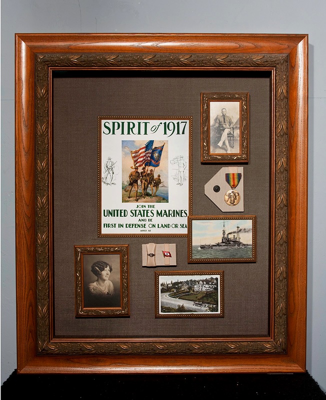
What are the elements that go into a beautiful, effective and unique frame design?  

There are litterally thousands of matting and framing options to explore:   do we add a fillet to the mat, or to the frame.  Do we use fabrics, such as linen, silk, suede or a multitude of other choices.  What is the mood we want to capture:  modern, contemporary, tradtional, victorian, or eclectic.  A romantic piece such as a wedding or engagement photo may suggest silks, golds and silvers with a fillet inside the mat.  A funny, funky piece of art may call for framing that is not the "normal" and require thinking outside the box with multiple moldings, mixed mats and whatever it takes to make the piece (not just the frame or just the art) look fabulous.  

A "masterpiece" is different for each person and each project and should reflect the art, the home and the client.

Come in with your art and your ideas.  Between us we will create your masterpiece.

Other pages to explore are: 
  • Elements of Design and Enhancing Your Art
  • Art Protection
  • Matting: a bit about why and what conservation matting is.
  • Mounting: the basics of why mounting is important
  • Glazing: A brief description of the types and uses of glass, acrylic and other glazing materials
0 Comments

Memorabilia/Shadow Box Samples

4/1/2015

0 Comments

 
1917
This box was completed for a framing competition.  The theme had to be historical and limited to a certain size.  I tied for first place in the Cascade Picture Framers Guild competition.
I designed the box using Larson Juhl moldings   The outer molding had to be modified by adding a 3" deep oak box to the back and staining to match the face frame.  I also had to build an inner frame around the opening of the face frame.  I used other frames in the set to accent the photographs and fillets around the postcards and poster.  I used an olive hand-wrapped silk to cover the mat and sides of the box.  A beige suede was used to make the platforms that hold the rings and pins.  The box was assembled with Tru-Vue Museum glass and all mats were preservation quality.  The frames around the photographs were lined with an aluminum barrier tape and the photos, poster and postcards were mounted on rag.

Mask
Framed mask sample by Larson Juhl. The mask is floating on a Crescent Suede with a top mat of the same suede lined with a fillet to accent the mask.  The sides of the box are lined with the same suede used for the mat.  Larson Juhl used Tru-Vue museum glass.  All the mats are preservation quality.

Geisha
This piece was part of a screen of bamboo that had broken.  The figure is padded silk and floated on top of a silk wrapped board on top go the screen.  I used a nubby, raw silk under the screen and to line the sides of the frame.  The frame is a walnut. spline joined frame stained espresso.  This piece was finished with conservation clear glazing.  

Bugs Box
Framed object is a sheet of Bugs Bunny stamps. I designed a cove box of slanted sides that I then colored with pastels in blues and rusts to look like the inside of the mail box.  A friend drew a cartoon hand to hold the letter (which is addressed with a hand-cancelled stamp).  I used Tru-Vue Museum glass for both it's anti-reflective and conservation qualities.  The mats user are all preservation quality
Picture
1917
Picture
Mask
Picture
Geisha
Picture
Bugs Box
0 Comments

    Author

    Sally Dallas,  Artisan Framer
    I've been custom framing since 1983 and I've owned my own business since 1996.  Enjoy

    Archives

    March 2019
    June 2015
    May 2015
    April 2015
    March 2015
    July 2014
    April 2012

    Categories

    All
    Art News
    Conservation/Preservation
    Design
    Industry Information
    My History
    Picture Framing
    Projects

    RSS Feed

Like me on my social media pages

copyright 2012
Newberg Gallery, Inc. 
Start with a visit, call or email to My Personal Framer.   
Sally Dallas, CPF, Custom Picture Frame Designer.
503.538.0888


Hours:  Tuesday -Thursday 10-4 pm, (lunch 1:30-2ish)
              Friday 10-2.  Other times & dates by appointment
115 N College St.  Suite 3
'round back and down under
  • Home
    • My Personal Framer >
      • My History in Framing
      • Testimonials
    • History-Gallery & Picture Framing >
      • The Room, views from the past
      • Pictorial History of 115 N College St
  • Custom Framing
    • Why Custom Framing?
    • Elements-Design >
      • Elements-Beyond Basics
      • Elements-Neutral Framing?
      • Elements-Mats
      • Elements -Protection
      • Elements-Canvas and Needlework
      • Elements-Memorabilia and Memory Box Framing
    • Featured Frame & Other Designs >
      • Past Featured Frame
      • Gallery Framing Review
      • More Ideas
      • Client Frame Designs
      • Before & After or What a difference Design makes
  • Framed Art for Sale
  • Art
    • Whati is a print and more
    • Featured Artist
    • Featured Artists-Past >
      • Jim Christensen
      • Jim Nilsen
      • Joanne Kollman >
        • Joanne Kollman Bio
      • Terry McIllrath
      • The Raven Folio
      • Annora Spence
    • sldallas photography
    • Artist Biographies
  • Contact Me
  • Favorites
    • Art Festivals - Local & Regional
    • Framing Corner Blog